
ABC
Identity
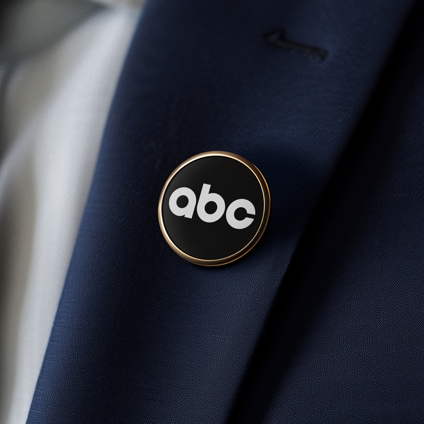
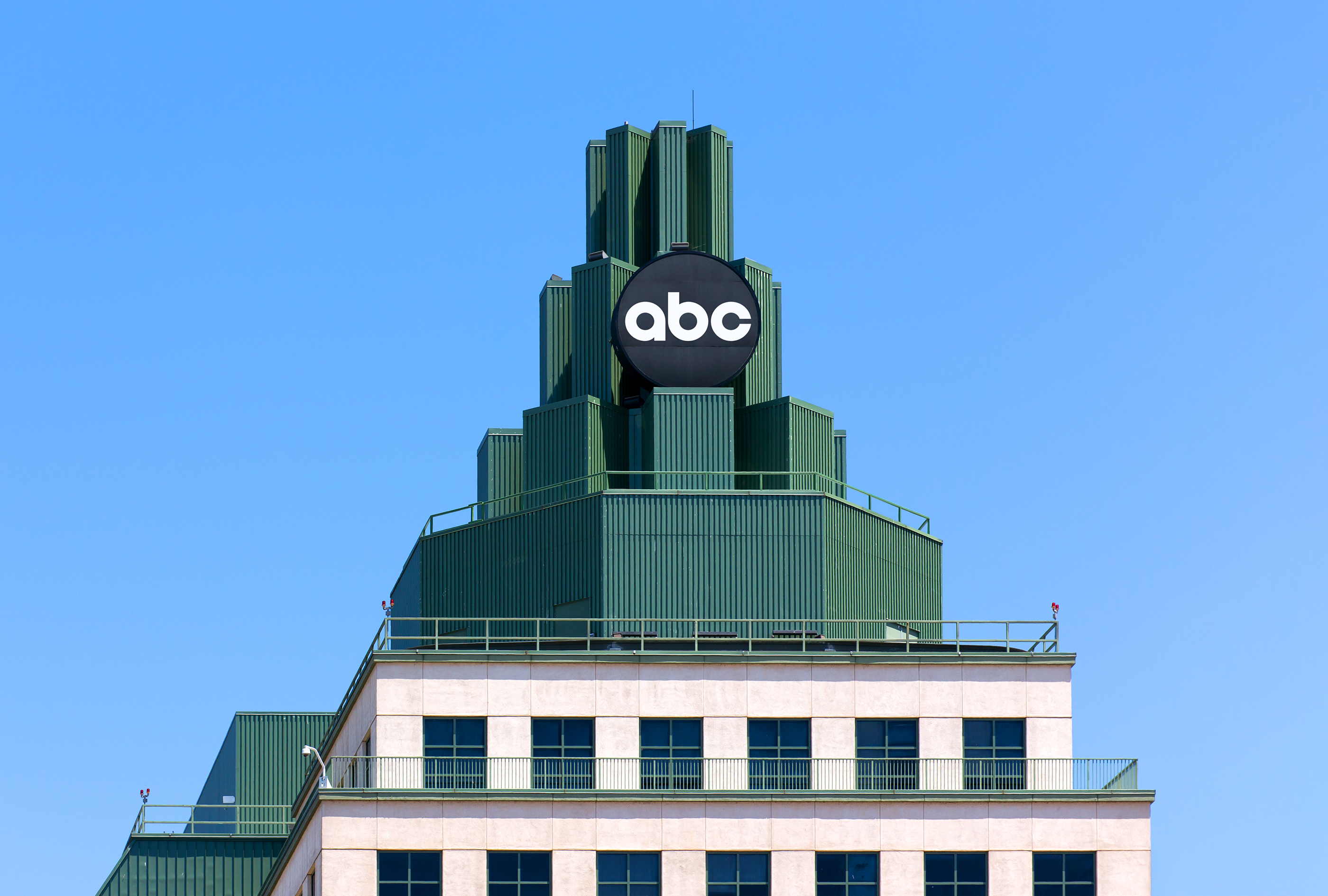
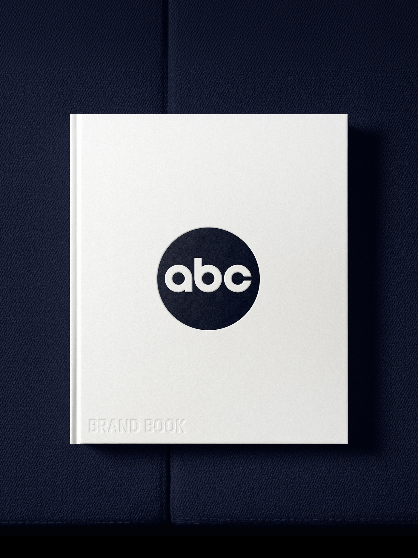
Since its inception over 60 years ago, the ABC logo has transcended its original function as simply station identification to become one of the most recognizable brands in the world. During that time, it has undergone many trend-based surface treatments, but an increasing need arose to address consistency issues and the technical limitations of the logo. These dual considerations of equity retention and the need for functional improvement formed the foundation for the first substantial update to the ABC masterbrand logo since Paul Rand's original 1962 design.
Equity Retention: We paid homage to Rand's design by subtly simplifying and strengthening the iconic letterforms. By reinforcing the essence of the original, our robust redrawing remains instantly recognizable as ABC, while also enabling us to establish a perfectly uniform 3-circle motif as the foundation for a more extensive brand system.
Functional Improvement: By eliminating all stylistic renderings, we immediately optimize cross-platform attribution. Increasing the space between the lettermark and globe container improves overall integrity at smaller scales, while also enabling both fill and outline versions to coexist within the same footprint. This mitigates inconsistency issues and improves brand recognition.
In its totality, this evolution pays respect to ABC's roots while establishing a more versatile and future-proofed system.


Additional Credits
On-Air Branding: Trollbäck+Company
On-Air Branding: Trollbäck+Company