Hobbes
Identity
Hobbes is a creative company established to tackle the challenges clients encounter in today's ever-evolving digital landscape. By positioning themselves at the intersection of design and emerging technologies, Hobbes merges animation with code to develop client-focused solutions, effectively bridging the gap between these disciplines.
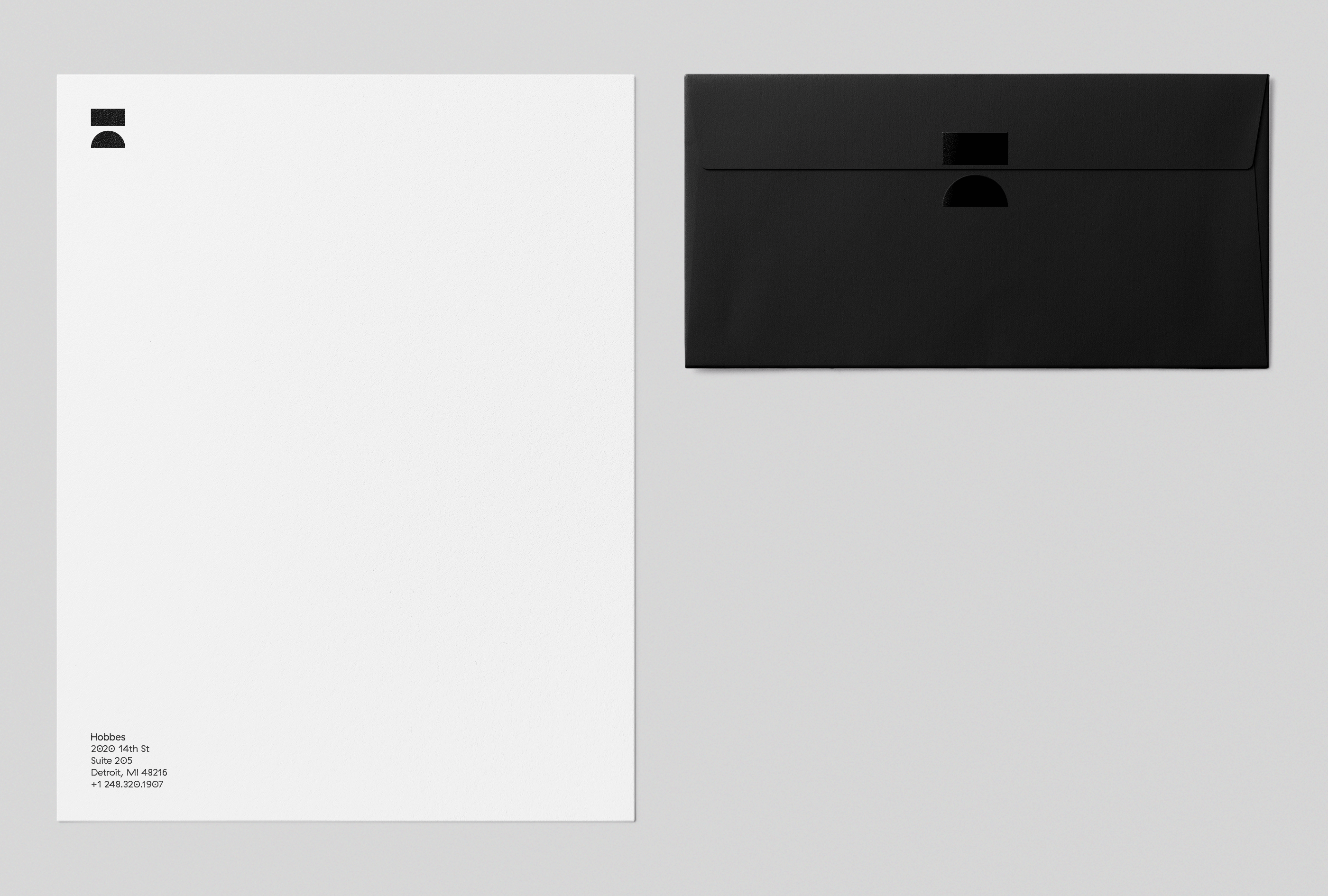
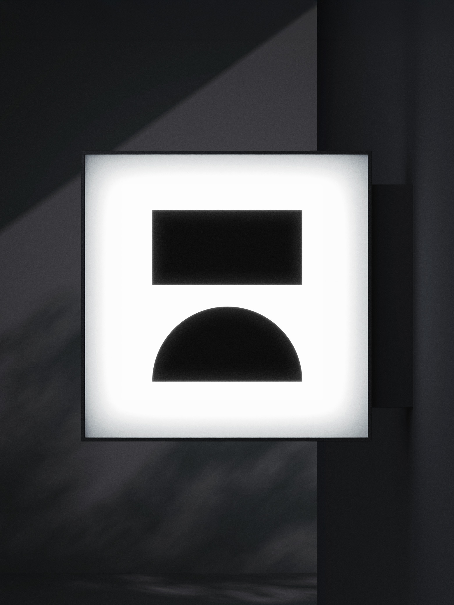
This bridge metaphor became the basis for their 'H' logo and serves as the cornerstone of their visual identity. We created a dynamic set of team avatars based on the bridge anatomy, along with print and digital collateral featuring a stark black-and-white silhouette palette to highlight their visually diverse output.
This bridge metaphor became the basis for their 'H' logo and serves as the cornerstone of their visual identity. We created a dynamic set of team avatars based on the bridge anatomy, along with print and digital collateral featuring a stark black-and-white silhouette palette to highlight their visually diverse output.


Additional Credits
Animation: Jordan Scott, Dan Stack
Animation: Jordan Scott, Dan Stack