Go-Bop
Identity
Go-Bop is introducing kimbap, Korea’s beloved seaweed rice snack, to the Canadian market. Conveniently packaged for freshness and portability, it offers a modern take on a traditional favorite, creating a new grab-and-go option for today’s consumers. While the product was already a proven hit, Go-Bop needed a confident, distinctive identity to establish its presence.
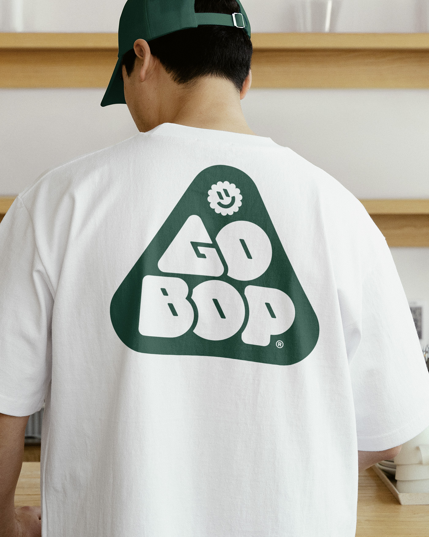
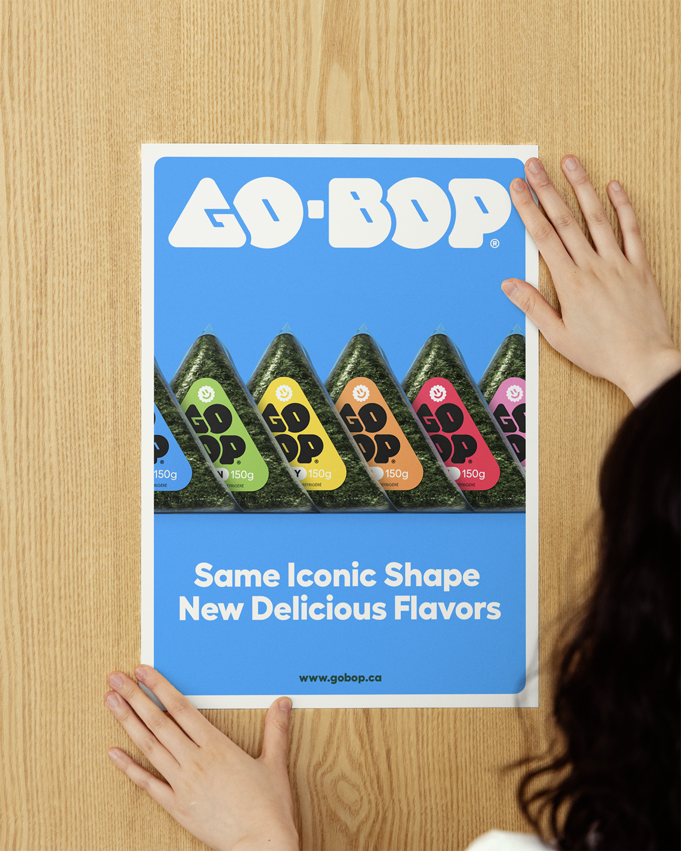
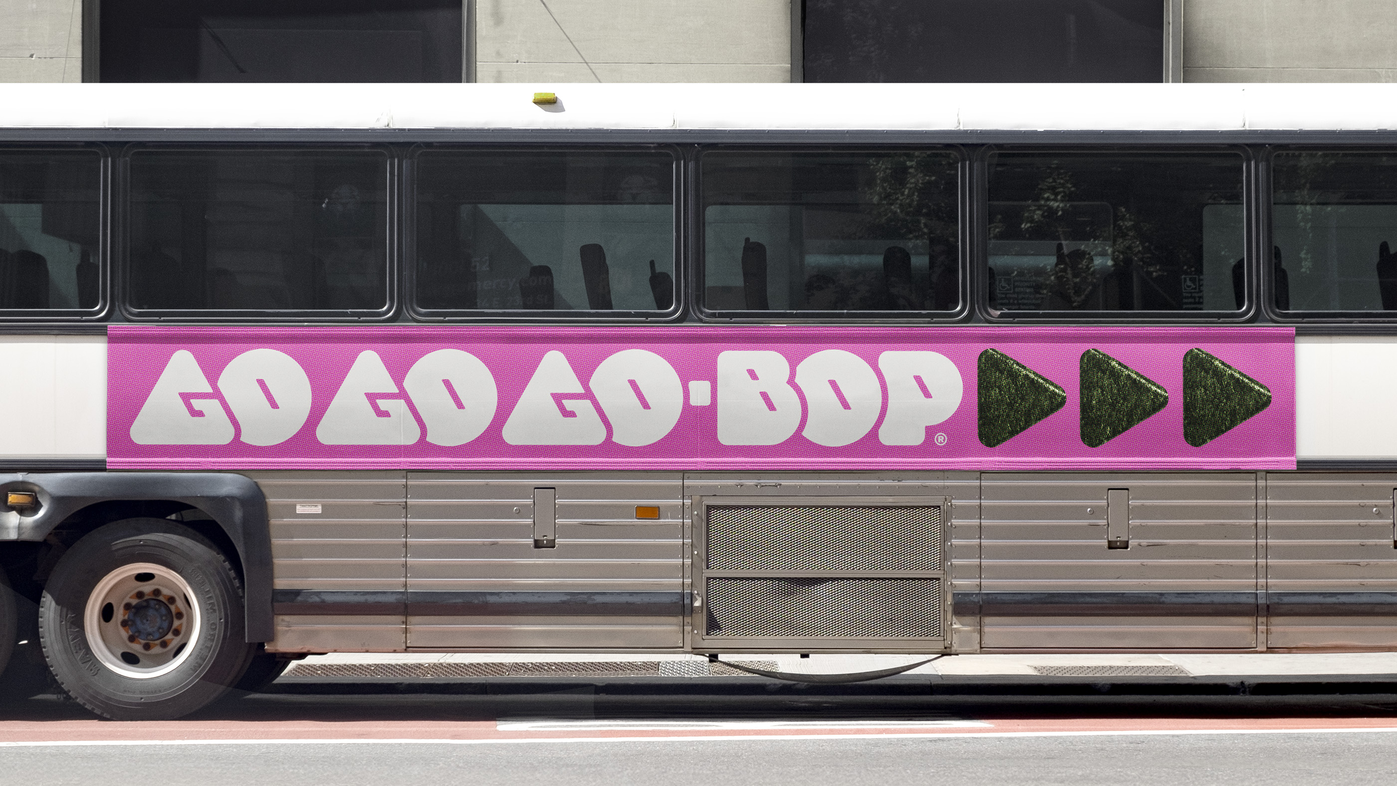
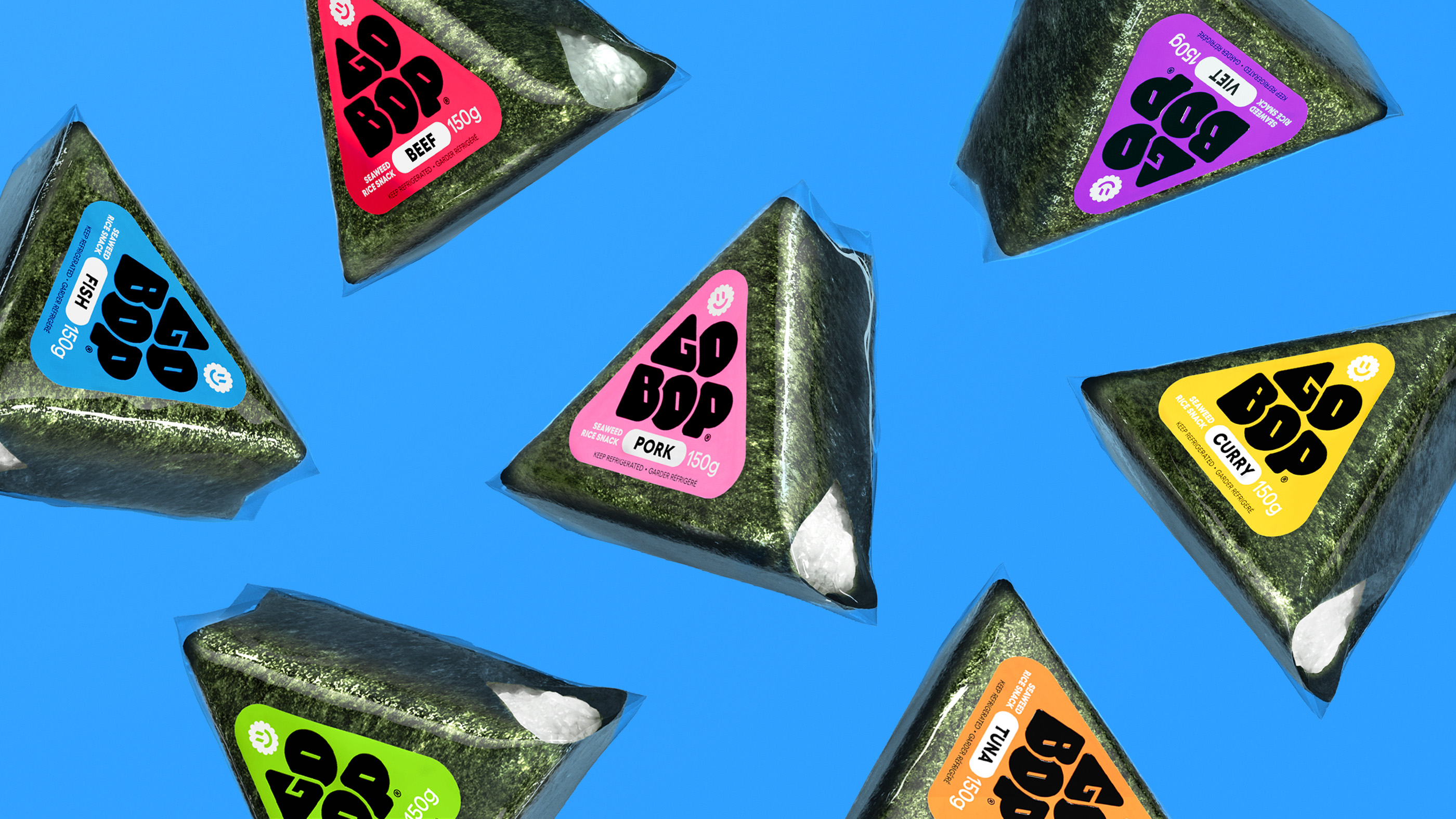
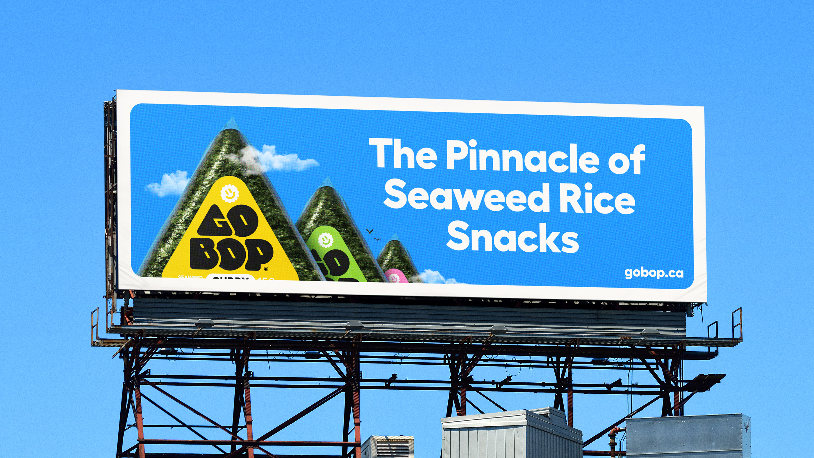
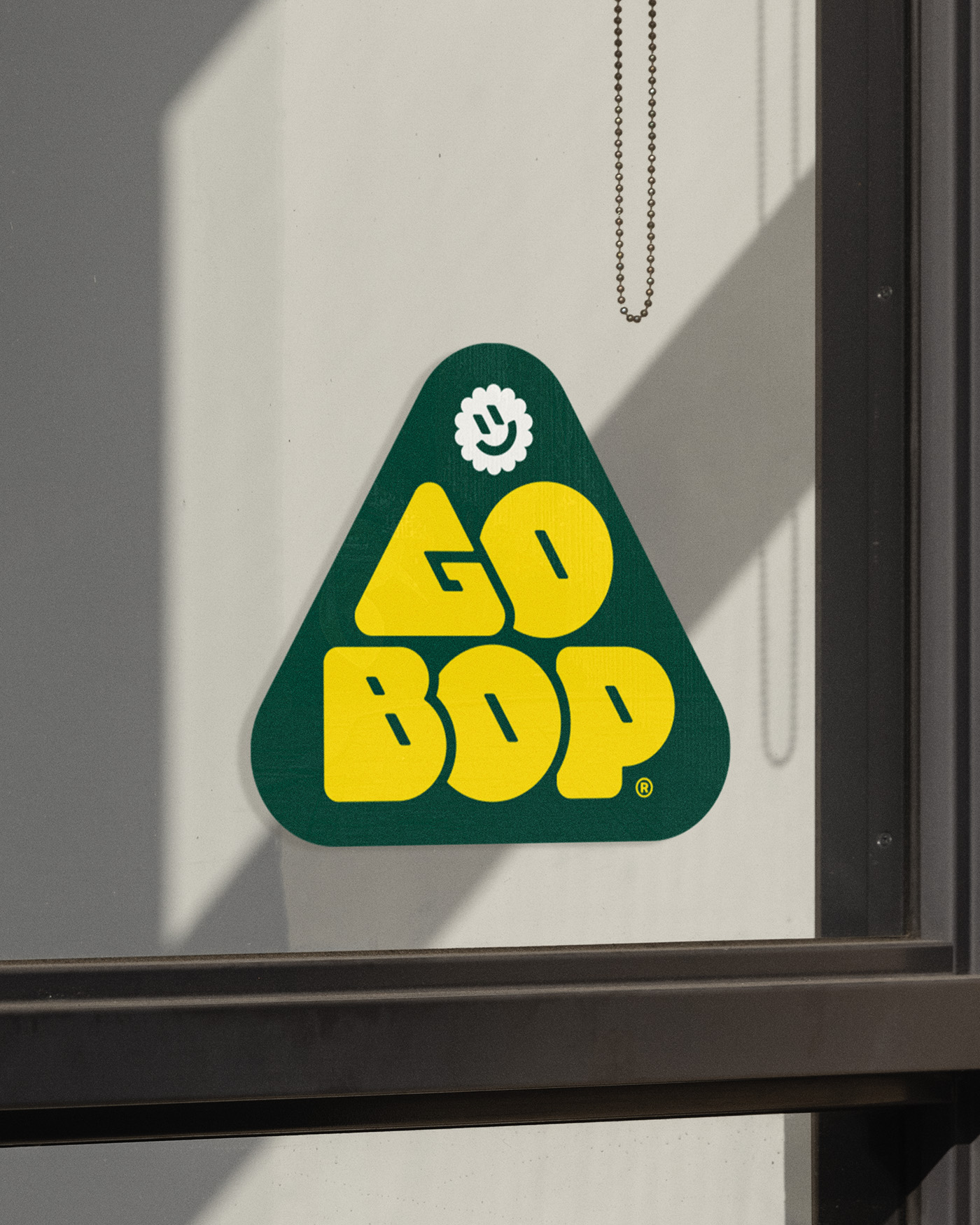
We developed a custom wordmark that echoes the triangular form of the snack, softened with rounded corners for warmth and friendliness. An ingredient-based color system differentiates flavors and supports future growth across SKUs and formats. Our playful rice mascot and flexible lockups help extend the identity across packaging, promotional materials, and out-of-home campaigns.
The result is a vibrant, adaptable brand system that makes Go-Bop stand out on shelves while staying true to its origins - approachable, fun, and ready to introduce a new audience to this classic, naturally healthy snack.



Additional Credits
3D Renders: Lukas Kawakami
3D Renders: Lukas Kawakami