Messenger
Illustration System
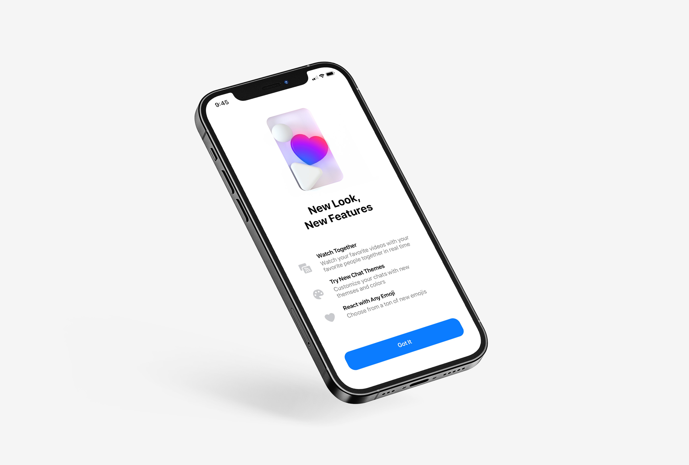
With more than 1.3 billion users, Messenger has evolved into one of the largest communication platforms in the world. As part of its global brand relaunch, the company sought to revamp its in-app illustration system with the goal of creating a sophisticated, universally understandable language while establishing an ownable and versatile aesthetic. No problem! Introducing Chroma ...
Leading an international team, we established process guidelines and developed a comprehensive suite of use-case illustrations in both static and animated form. We began by creating a conceptual foundation for the illustrations, incorporating clear and iconic imagery within the UI surface itself. Next, we formulated design and animation principles that not only reinforced concepts but also improved overall user comprehension. This new system of process rules ensures a consistent brand voice while helping users better understand the content, features, and information within Messenger.
Leading an international team, we established process guidelines and developed a comprehensive suite of use-case illustrations in both static and animated form. We began by creating a conceptual foundation for the illustrations, incorporating clear and iconic imagery within the UI surface itself. Next, we formulated design and animation principles that not only reinforced concepts but also improved overall user comprehension. This new system of process rules ensures a consistent brand voice while helping users better understand the content, features, and information within Messenger.

Additional Credits
Meta CD: Graham Hill
3D Animation: Toast
Sound Design: Proper
Meta CD: Graham Hill
3D Animation: Toast
Sound Design: Proper