
Popcore
Identity
As a global leader in the hyper-casual gaming industry, Popcore creates mobile experiences that have mass appeal and foster long-term engagement. After years of operating with an inadequate logo, it became evident Popcore needed a new visual identity to align their external image with their internal values and their vision for future growth.
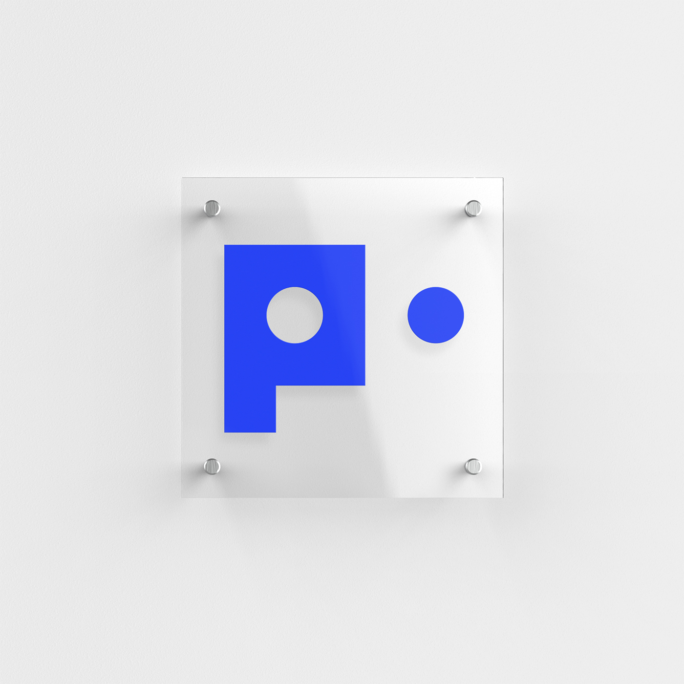
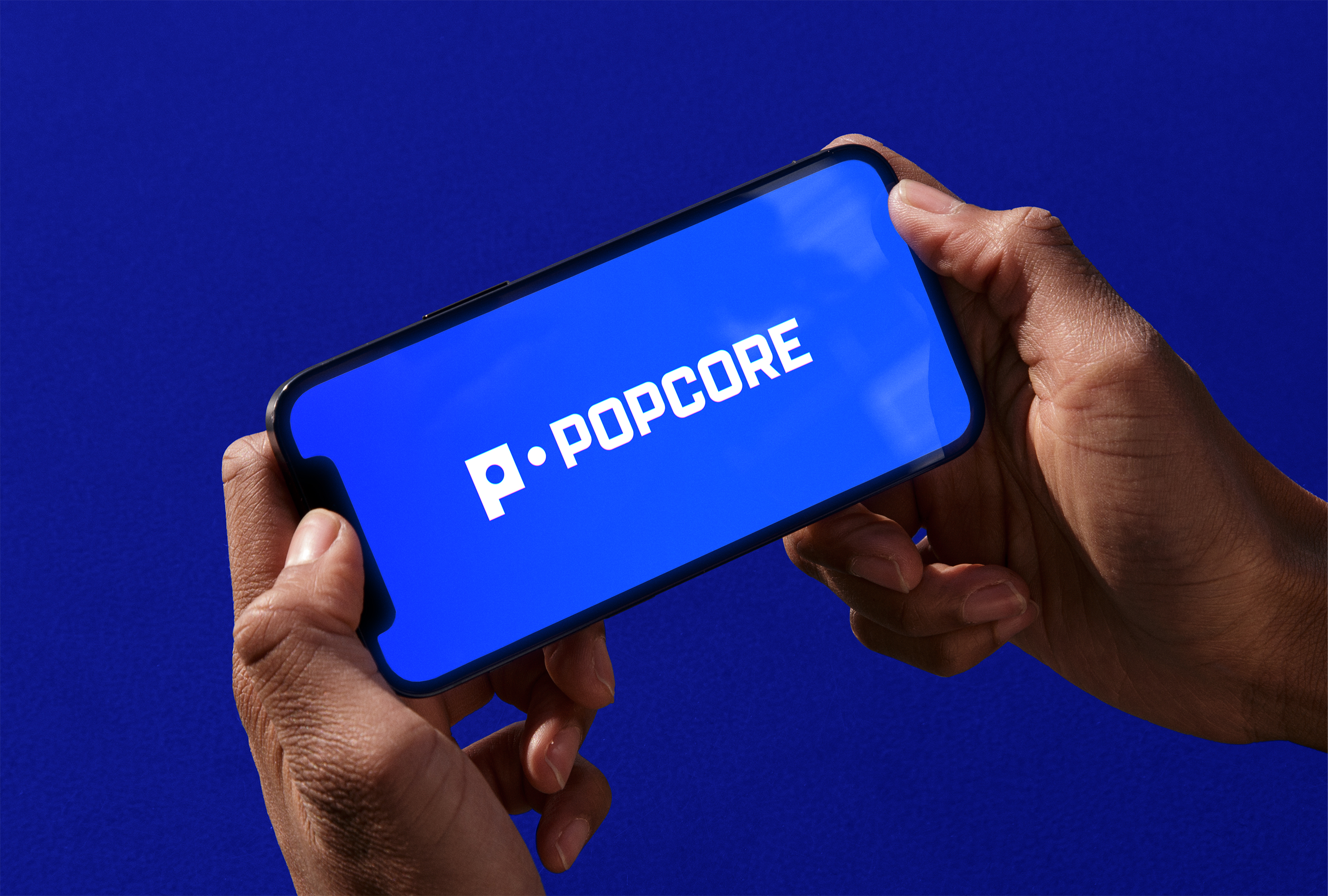
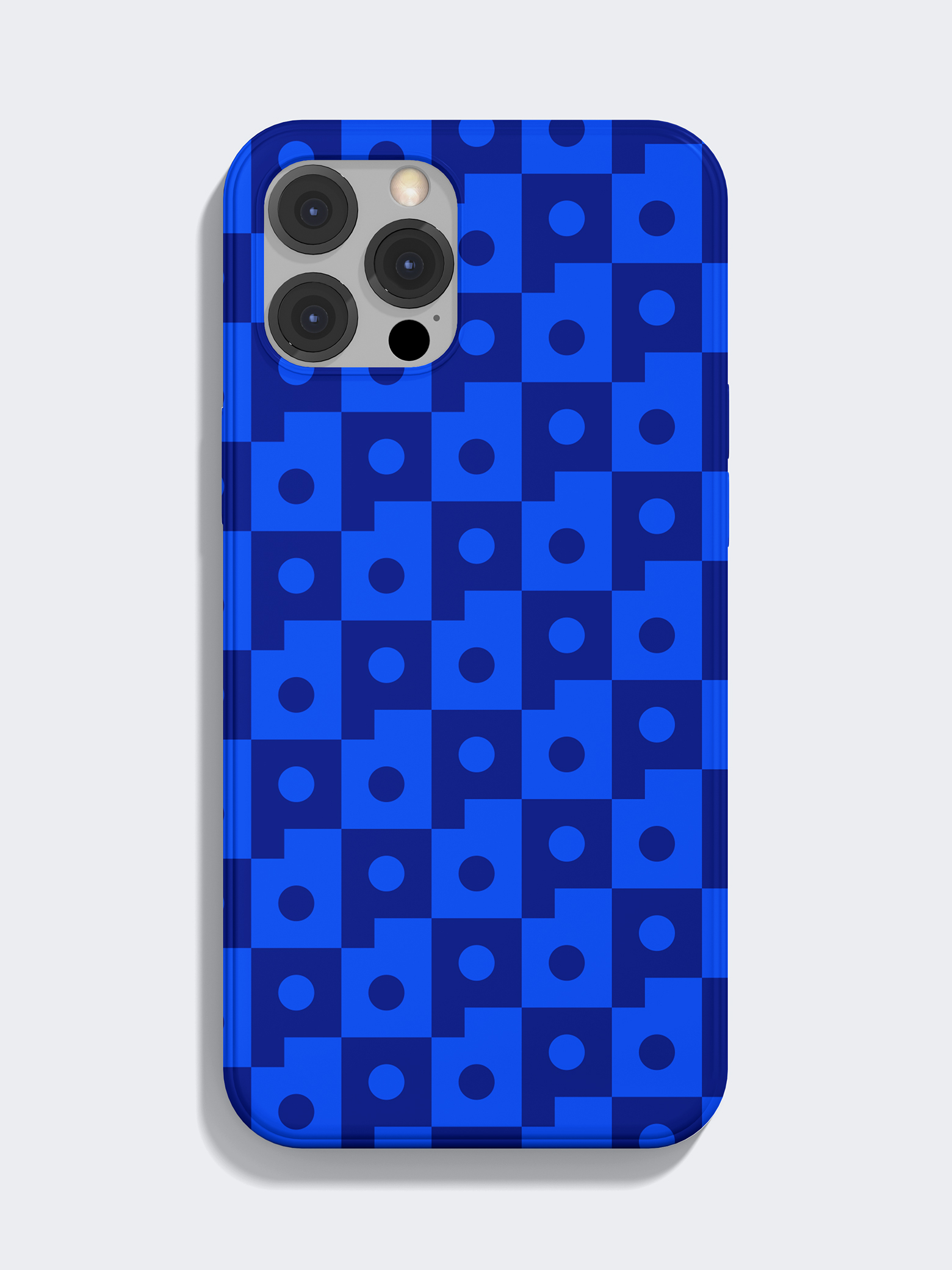
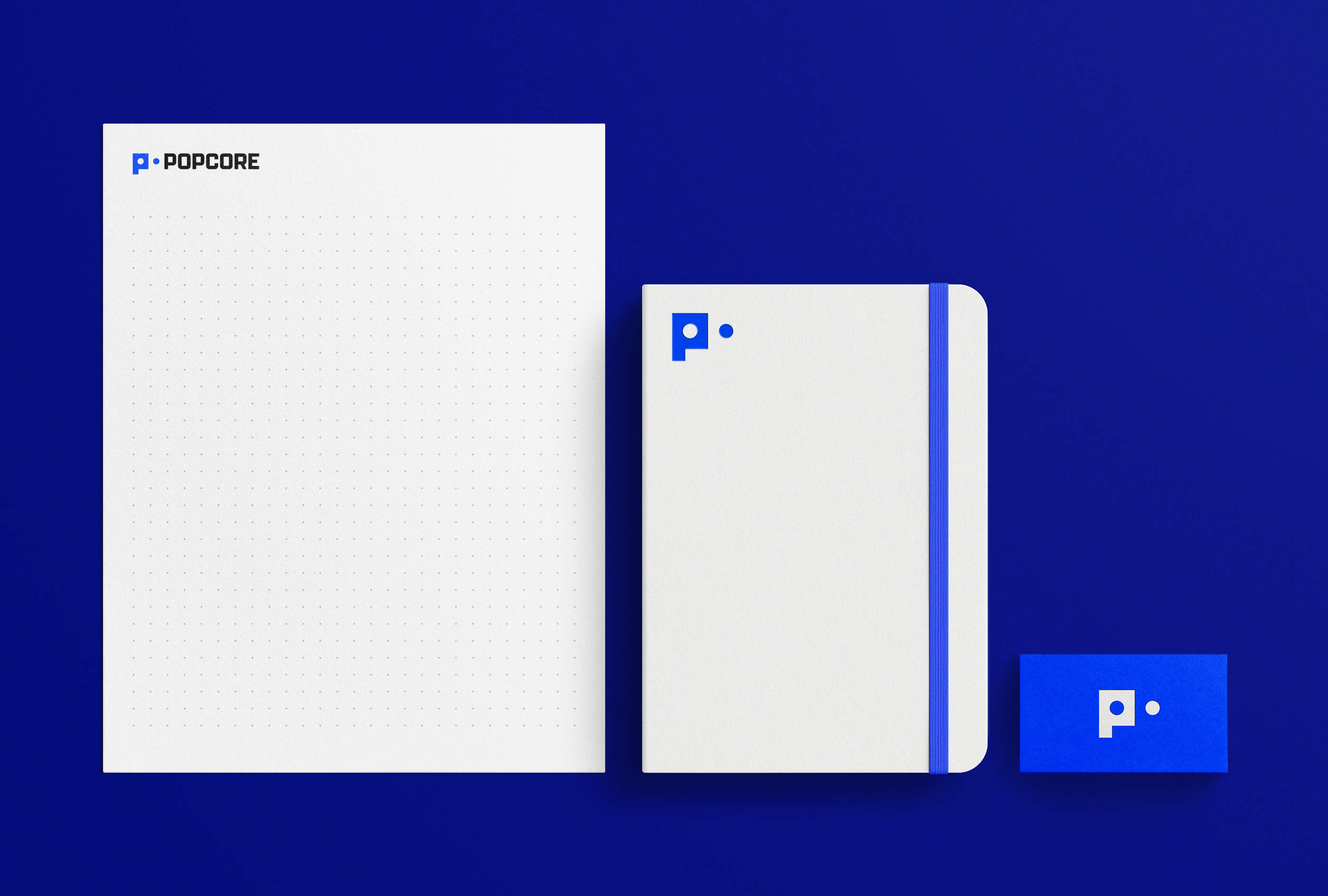
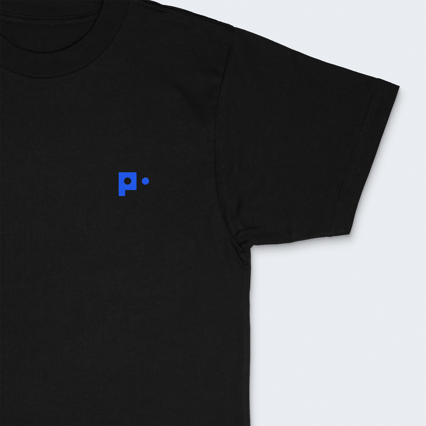
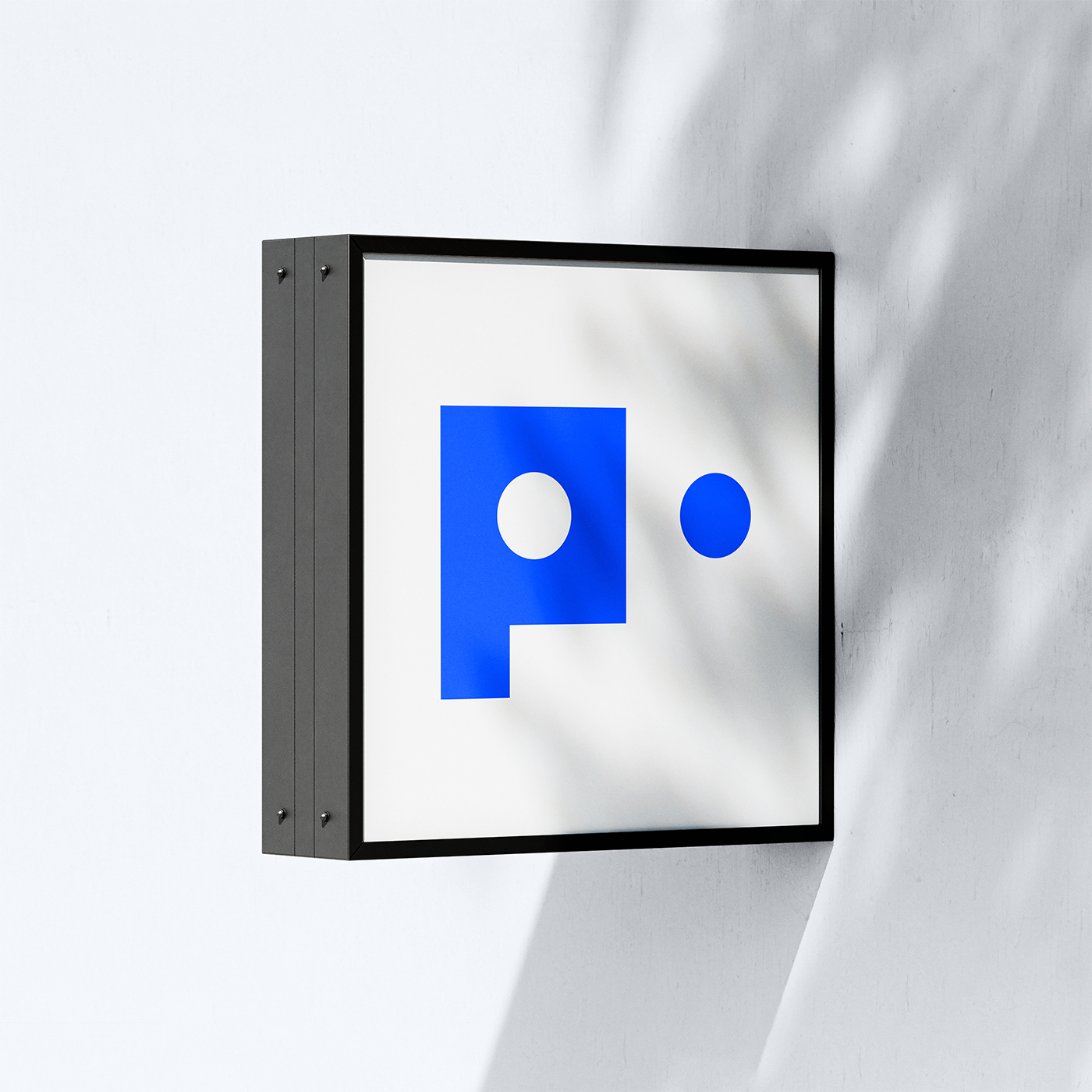
We began by incorporating Popcore's two key elements into their new identity: 'Pop' (representing their goal of popularity) and 'Core' (representing their core process values) as contrasting rounded and squared shapes. By combining these forms, we symbolized the different facets of their company while highlighting the central 'core' in the logo letterform. This contrast is further emphasized through a bold, simple palette and branding that more accurately reflects the company's confident energy as they continue to push boundaries in the hyper-casual sector.
We began by incorporating Popcore's two key elements into their new identity: 'Pop' (representing their goal of popularity) and 'Core' (representing their core process values) as contrasting rounded and squared shapes. By combining these forms, we symbolized the different facets of their company while highlighting the central 'core' in the logo letterform. This contrast is further emphasized through a bold, simple palette and branding that more accurately reflects the company's confident energy as they continue to push boundaries in the hyper-casual sector.

Credits
3D Animation: David Pocull
Typeface: Aeonik by CoType
3D Animation: David Pocull
Typeface: Aeonik by CoType